Promoting Wellness with Color
Colors are crucial in a space, and it’s also a simple touch that can greatly improve the wellness outcome for occupants as well. How one might feel in an environment can be greatly impacted by the surrounding’s visuals, and in these turbulent times, the right color can help calm and empower people. Color helps set the tone. It has the power to impact mental health, and being mindful of this is all a part of the decision-making process when designing human-centered spaces.
While recent events have elevated their need, the science behind the psychology of colors is a long and storied one, and it’s something that Mercedes Austin, CEO of Mercury Mosaics, knows incredibly well in her experience as a tile designer. By using the right colors in the right places, designers can create transformative spaces that become spa-like sanctuaries, meditative retreats or social hotspots enveloped in warmth and ease.
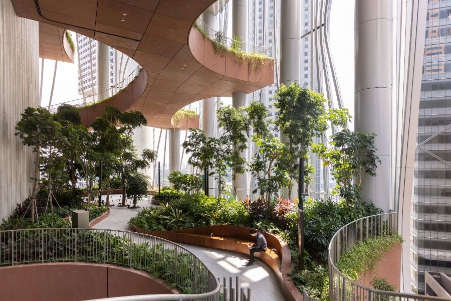
Greens Help Focus and Re-Energize
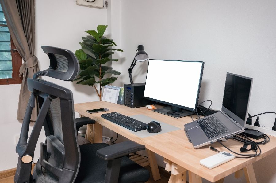
With the rise of remote work and remote learning, there has come with it a high demand for spaces in homes that promote productivity and focus. Not to mention, there is a very real struggle for many to combat the fugue state that the pandemic has left them in. According to Mercedes, the perfect color to address these needs lies within nature.
“Greens colors like emerald bring more energy and focus,” she says. “When we’re exposed to these colors from nature, especially while indoors, it brings a sense of rejuvenation.”
Aside from triggering a biophilic response, however, green is also one of the easiest colors for eyes to perceive, which helps it soothe and destress when viewed.

Blue Colors Can Soothe and Relax
“According to Ashley Banbury of HGTV Home,” Mercedes says “’Surrounding yourself with calm watery tones of blues and sea-glass shades can create a space that is both calming and sophisticated.’” For this reason, these tones are well-suited for use in residential baths, where its role as a wellness space has only continued to grow over time. It’s relaxing hues also make it the perfect candidate for the bedroom and the sleepless of the world.
Just don’t go overboard. Aside from its tranquil effects, too much blue can work as a depressant. It’s also known to suppress appetites, so you wouldn’t want to use it too much in a kitchen design.
Rusty, Moody Tones Offer a Sense of Comfort
The need for comfort has, above all else, driven a considerable number of renovations and remodels since the start of the pandemic. The home has come to be recognized as the sanctuary as it is, and years of isolation for many has highlighted the importance of social interactions to many when it comes to personal wellbeing.
“Rust and moody tones bring these elements of warmth and comfort into a space. Often warm and deep tones offer a grounding feeling, an earthy-connection evoking resiliency.” Think deep, dark yellows, rich clay and woody tones as well. These are the best for living rooms, kitchens and other social spaces where a sense of belonging is welcome.
Light and Bright Tones Open Up Cramped Spaces
Humans crave broad, open landscapes, but as we spend 90% of our time indoors, those vast spaces are often replaced with smaller, cramped ones. The strategic placement of color, according to Mercedes, will help “draw the eye and experience in a space – making it feel much larger than it is.” Think of the tremendous, stained-glass murals in places of worship, drawing eyes up into the cavernous ceilings.
“Lighter, brighter hues and consistent placement create a feeling of a larger space. You can have a majority of neutral, light tones, while adding a pop on one focal wall that will drastically change your perception of the space’s size.”
Coupled with the inclusion of natural lighting, a claustrophobic space can breathe.

Natural Colors and Textures Help Rooms Feel Less Empty
On the other side of the coin, a space that’s too open can be just as problematic. Too much empty space can appear stark, hollow. “When working in big spaces, it’s important to think of materials in combination with colors,” Mercedes says.
“Think textured concrete, aged wood or weathered brick. Architectural elements thoughtfully included bring in the element of storytelling in an environment which contributes to it feeling welcome and less empty.”
Final Thoughts on Promoting Wellness Through Color
“When designing and constructing a space, for me, it’s about layers and textures,” explains Mercedes. “I love the mix of hard, durable materials like concrete and metal while keeping things warm with wood and different carpet and fabrics. Add to that wallpapers and tile placement and you arrive to a space with a very visual story that, overall, creates a specific mood.
“I begin with the bones of the space, the natural light available, and I work from the intention and the end use of the environment. I believe that materials and humans need to work in harmony and that function supports aesthetics. Honoring industrial-grade materials and color stories with grounding, warm design is just one of my strategies to elevate these spaces.”


